


Most businesses treat signage as an afterthought, ordering a storefront sign here, a trade show banner there, and a few interior plaques somewhere in between. The result is a fragmented visual environment that confuses customers and dilutes brand equity. The smarter approach is systematic: understand which sign types serve which locations and use cases, then specify accordingly.
This guide cuts through the guesswork that plagues even experienced buyers. Whether you are sourcing custom signs for business locations, events, vehicles, or interior wayfinding, the decisions you make around materials, formats, and installation methods determine whether your signage works as a unified brand asset or just occupies space.
In the sections ahead, you will learn how to audit your signage needs before placing a single order, how to match exterior and interior sign types to their environments, and how event, vehicle, digital, and specialty formats each solve distinct communication challenges. You will also find a practical materials reference and a framework for building a cohesive signage program across every customer touchpoint. By the end, you will have the vocabulary and the criteria to specify confidently rather than guess.
How to Think About Signage Before You Buy Anything
Most businesses buy signs the way they buy office supplies: reactively, one item at a time, when something is missing or broken. The result is a branded environment that looks assembled by committee over a decade, because it was.
A more effective approach treats signage as a system before treating it as a purchase. Every signage decision involves four dimensions: location (indoor vs. outdoor), purpose (informational, promotional, wayfinding, or regulatory), technology (static vs. digital), and use case (retail storefront, corporate office, event, vehicle fleet). Missing any one of these dimensions when specifying a sign creates mismatches that cost money to correct later.
These dimensions also overlap. An outdoor pylon sign is a location decision, but it is simultaneously a promotional asset and potentially a regulatory compliance item if it includes required business licensing information. An interior lobby directory serves wayfinding, but it also reinforces brand identity every time a visitor walks past it. Understanding these overlaps is what separates a sign order from a signage strategy.
Reactive purchasing has a visible signature: mismatched typefaces across exterior and interior signs, color that drifted between vendors, materials that look fine individually but clash as a system. Organizations that have ordered from three different vendors at three different points in time often discover this problem during a rebrand or facility audit, when fixing it is far more expensive than coordinating it would have been.
The systematic alternative starts with a touchpoint audit before specifying anything. Walk the path a first-time visitor takes, from the parking lot through the lobby to a conference room or patient bay. Document every location where a sign exists or should exist. Then extend that audit to your event presence and vehicle fleet. That inventory becomes the brief.
Before diving into specific formats and materials, it is also worth aligning your signage decisions with your broader brand standards. If your organization has not yet started with the brand decisions that matter, doing that work first will save significant rework when signs go into production.
The payoff of planned signage is practical: consistent brand recognition across locations, fewer permit and code violations caught after installation, reduced reordering costs when replacement signs match the original spec, and environments that communicate competence rather than undercutting it.
Exterior Signage: Getting Seen Before the Door Opens
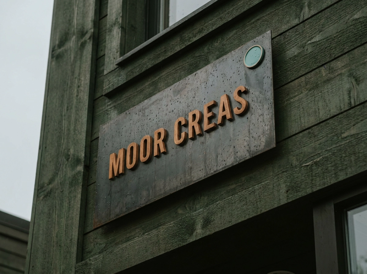
The parking lot, the street, the highway interchange, exterior signage works before a potential customer ever reaches your door, and format selection determines how much of that opportunity you actually capture.
Matching Format to Site Configuration
The six primary exterior formats, storefront wall signs, monument signs, pylon and pole signs, fascia and parapet-mounted signs, awnings, and window graphics, are not interchangeable. Each is optimized for a specific visibility range and site type.
Monument signs sit low to the ground with a solid base, making them right for campus-style facilities, professional parks, medical complexes, and locations set back from the road where a wall-mounted sign would be too distant to read. Pylon and pole signs solve a different problem: in high-speed corridors, vertical height creates visibility beyond what any wall-mounted sign can achieve, giving drivers adequate time to react and exit.
Window graphics serve two functions simultaneously. For retail storefronts, clinics, and professional offices, window vinyl delivers branded presence while providing privacy screening or UV control. A well-executed custom business logo applied to glass can anchor the entire facade without a fabricated cabinet sign.
Material Selection Is Not Optional
Aluminum resists corrosion and holds its finish in wet climates, making it reliable across the Pacific Northwest and other high-precipitation regions. Acrylic handles UV exposure without yellowing, which matters for any sign expected to maintain a polished appearance over several years. Vinyl works for large-format applications at a lower cost but requires periodic replacement and is not appropriate as a permanent solution in harsh environments.
Permits, Zoning, and Sight Lines
Municipal codes govern sign height, square footage, illumination, and setback distances, and they vary by jurisdiction. Some cities cap exterior signage at a formula tied to building frontage; others restrict illuminated signs specifically. Sign regulations in Raleigh, for example, limit single-establishment signage in mixed-use districts to 2 square feet per linear foot of street-facing building frontage. Installing without permits risks fines and forced removal, which often costs more than the permit process.
Sight lines are equally critical. A sign obscured by a utility pole, tree canopy, or driveway angle loses most of its value regardless of design quality. Before finalizing placement, evaluate the sign from every realistic approach angle and at night, when ambient lighting changes how color and contrast read from the road.
Interior and Wayfinding Signage: Guiding People and Reinforcing Brand
Once visitors step through the door, the job shifts from attracting attention to guiding it. Interior signage serves two overlapping functions: navigation, helping people reach their destination without friction, and brand reinforcement, communicating organizational identity through every lobby, corridor, and conference room along the way.
Core formats include lobby identity walls, dimensional lettering, door and room identification signs, directory boards, wayfinding arrows, floor graphics, and large-scale environmental graphics that carry a brand narrative across entire wall surfaces. Each format has a distinct role, and most facilities need several working together.
ADA compliance is not optional. For any public-facing facility, interior wayfinding signage must meet the ADA Accessibility Guidelines, which specify tactile character dimensions and spacing, mounting heights, finish contrast ratios, pictogram sizing, and the placement of contracted Braille on room and door identification signs. These requirements apply to healthcare facilities, government buildings, schools, and multi-tenant commercial properties. Non-compliance carries real consequences: costly retrofits, fines, and accessibility barriers that expose organizations to liability.
Healthcare campuses and multi-floor office buildings carry the most demanding interior signage requirements. Complex floor plans, high visitor turnover, and stress-sensitive populations make clear wayfinding a functional necessity, not a design preference. A well-executed system reduces the burden on staff who would otherwise spend significant time redirecting lost visitors, and it measurably improves the experience for patients, clients, and guests navigating unfamiliar spaces.
Consistency across every interior surface is equally critical. A premium brushed-aluminum lobby identity wall loses credibility if the room signs down the hallway use a different typeface or finish. Custom business signs in interior settings must reflect the same typography, color palette, and material standards used throughout the branded environment. Inconsistency signals a lack of attention to detail, and visitors notice even when they cannot articulate why.
Schools, government agencies, and nonprofits frequently underestimate how much interior signage a facility actually requires. The full scope typically becomes clear only during a renovation or a compliance audit, at which point retroactive updates cost significantly more than planned procurement would have. Organizations planning facility updates benefit from mapping signage needs across the entire building before specifying anything, when renovation or compliance audit triggers comprehensive updates.
Event and Trade Show Signage: Portable Presence That Travels Well

Event and trade show displays travel, set up under pressure, and compete for attention in a room full of other exhibitors doing the same thing.
Matching the format to the booth is the first decision. Retractable banner stands work well for small inline booths where floor footprint matters. Pop-up fabric and tension fabric structures cover larger back walls with a clean, seamless look. Step-and-repeat backdrops serve double duty as branded photo opportunities. Tabletop displays suit conference tables and small exhibit areas. Kiosk systems and backlit panels are better for larger island booths where the goal is stopping foot traffic from a distance.
Setup time is a real operational constraint. Many venues give exhibitors a narrow window to build out, and a display that requires two people and significant assembly can create serious problems when floor access is limited. The best portable displays pack into rolling cases, set up quickly by one person without tools. If you are specifying a system for a team that travels without dedicated trade show staff, that simplicity is non-negotiable.
Backlit displays and LED-illuminated graphics are visually more arresting in crowded show halls than flat printed panels. For organizations exhibiting regularly across a season, the premium hardware cost is spread over many events, improving the long-term value of the investment. Venue regulations around electricity and rigging vary, so confirm power access and overhead restrictions before specifying an illuminated system. The IAEE’s exhibitor compliance guidance is a useful starting point for understanding what different venues allow.
Design the structure for reuse. Display systems with swappable graphic panels let you update messaging for different campaigns without replacing the hardware. A tension fabric frame that accepts interchangeable print panels is a better long-term investment than a custom-fabricated display that becomes obsolete when your branding changes.
For organizations that exhibit regularly, knowing where your displays are, what condition they are in, and what needs reprinting before the next show prevents rushed orders and missed deadlines. Pairing your display system with thoughtfully chosen trade show promotional products reinforces the branded experience beyond the booth itself.
For broader creative direction, trade show booth branding ideas that draw crowds can help frame the display investment within a complete exhibit strategy.
Vehicle and Fleet Signage: Your Brand on the Move
Where event displays travel to the show and come home, vehicle signage stays in the field every day, which makes format selection a longer-term commitment than most buyers anticipate.
Full wraps cover the entire vehicle surface with printed vinyl, delivering the highest visual impact of any format and providing a layer of protection for the underlying paint. The tradeoff is real: professional installation is required, the vehicle surface must be clean, smooth, and properly prepped, and the process takes the vehicle out of service for at least a day or two. For organizations where the vehicle itself is a primary customer touchpoint, that investment is justified.
Partial graphics cover specific panels, typically the doors, hood, or rear, and deliver strong visual return at a lower cost. They work particularly well for fleets where vehicles rotate frequently or are leased, since partial vinyl is easier to remove cleanly than a full wrap.
Cut vinyl lettering is the most economical option and appropriate when the goal is basic identification: company name, phone number, and website. It lacks the visual presence of a full or partial wrap, but it gets the job done for vehicles that are not client-facing as frequently.
Magnetic signs serve a specific situation well: a vehicle that splits time between personal and professional use, or a small fleet that rebrands seasonally. They are not a permanent solution. Magnets left on a vehicle attract moisture and grit underneath, and they can be lost or stolen if not removed and stored at the end of each workday. Use them for flexibility, not for permanence.
For any fleet of five vehicles or more, a templated design system is worth building before the first wrap is ordered. A single approved design file, adapted for each vehicle body type, keeps the brand consistent as vehicles are added or replaced and reduces per-unit production cost over time.
The brand integration point matters more than most fleet buyers realize. A contractor’s service van, a healthcare home-visit vehicle, and a public safety unit are often the first, and sometimes the only, branded touchpoint a customer or community member encounters. The colors, typography, and logo treatment on that vehicle should match the organization’s building signs, uniforms, and printed materials exactly. Inconsistency across those touchpoints signals disorganization, even when it is simply the result of ordering from different vendors at different times.
Illuminated and Specialty Signs: When Standard Formats Are Not Enough
When static flat-panel formats and vehicle graphics are not enough to carry the brand, illuminated and specialty sign formats close the gap.
Illuminated sign formats cover a broader range than most buyers realize. Channel letters are individual three-dimensional letters with internal LED lighting, mounted directly to a building face or raceway. Cabinet signs are lightbox-style enclosures with illuminated faces, typically used for larger wall or pylon applications. Backlit panel signs push light through a translucent graphic surface. Halo-lit reverse channel letters are mounted with a gap from the wall, projecting a glow behind each letter rather than through it. Custom neon signs, whether traditional glass or modern LED neon flex tubing, round out the category.
Channel letters are the dominant choice for exterior retail and commercial signage because they combine weather resistance, high visibility, and a premium appearance that reads clearly in both daylight and at night. Buyers specifying exterior signage for leased space should review their lease and confirm any landlord format requirements before selecting a sign type.
Custom neon signs are a strong match for retail, hospitality, bars, restaurants, and salons, where ambient atmosphere and social shareability are part of the brand strategy. For most commercial applications, LED neon flex tubing has become the practical default for new commercial installations. It is more energy-efficient, more durable, safer to ship and install, and can be fabricated in nearly any color or shape while producing a visually similar effect. Traditional glass neon has its appeal in certain contexts, but LED neon is the practical default for new commercial installations.
Permitting is a distinct layer of complexity for illuminated signs. In addition to standard sign permits, illuminated installations require electrical permits. That complexity scales with sign size and installation method; rooftop and building-integrated applications typically involve the most review time and coordination with local building departments.
Specialty dimensional signs serve a different purpose than illuminated formats. Fabricated letters, logo cutouts, and textured wall-mounted elements are built for impression rather than information. They perform well in lobbies, reception areas, and branded interior environments where the goal is to communicate organizational identity the moment someone walks in the door.
Digital Signage: When Static Formats Cannot Do the Job
Illuminated and specialty signs solve the visibility and atmosphere problems that standard flat signs cannot. Digital signage addresses a different challenge entirely: what happens when the message itself needs to change.
The core formats are electronic message centers (EMCs), LED reader boards, digital menu boards, indoor and outdoor video walls, digital directories, and dynamic point-of-purchase displays. What they share is remote content updating without reprinting, which is the capability that justifies the added investment in the right contexts.
Where digital signage earns its cost
The strongest use cases are environments where the message changes frequently. Quick-service restaurants update pricing and limited-time offers across dozens of locations simultaneously. Retailers rotate promotions weekly without producing new print materials. Healthcare facilities manage patient flow, appointment announcements, and policy updates in real time. Corporate lobbies display live metrics, visitor information, and internal communications that would be obsolete on a printed board within days.
Where static signage remains the better choice
Dynamic content capability adds no value to building identification signs, regulatory compliance notices, directional wayfinding markers, or vehicle graphics. Those applications need permanence and durability, not flexibility. Spending on digital infrastructure for a monument sign or an ADA-compliant room identifier is a cost that produces no return.
A practical decision threshold
If your messaging changes frequently, pricing, promotions, patient flow, or real-time information, digital signage is worth evaluating. If your messaging is stable, static fabricated signs will outperform a digital investment on total cost of ownership.
Hybrid approaches are increasingly practical
A monument sign can combine a static fabricated cabinet with a smaller integrated LED reader board for changeable copy. A trade show booth can pair printed tension fabric graphics with a monitor for product demos. Neither scenario requires choosing one technology over the other.
Evaluate total cost of ownership, not just hardware
Digital signage infrastructure includes content management software, network connectivity, display hardware, and ongoing maintenance. The hardware purchase price is often the smallest line item over a five-year period. Organizations that budget only for screens and discover the ongoing costs later tend to underutilize the system or abandon it. Build the full infrastructure cost into the evaluation before committing.
Signage Materials at a Glance: Matching Material to Application
Choosing the right sign format means nothing if the substrate fails in the field. Here is how the core materials map to their best applications.
Acrylic is the preferred material for premium interior signage, illuminated displays, and exterior applications where finish quality matters. It machines cleanly, making it well-suited for dimensional letters and routed shapes. It also resists UV yellowing better than many comparable plastics, which is why it appears regularly in both lobby installations and exterior-facing applications that need to hold their appearance over time.
Aluminum composite material (ACM) is the standard for outdoor flat-panel signage. It combines a lightweight profile with meaningful rigidity and strong corrosion resistance, available in a range of painted and metallic finishes. Building directories, site identification panels, real estate signs, and exterior panel systems are all natural fits. Where a heavy-gauge steel or solid aluminum panel would add unnecessary weight and cost, ACM delivers comparable durability at a fraction of either.
Vinyl is the most versatile substrate in signage. Cast vinyl, designed for long-term exterior exposure, is appropriate for vehicle wraps, long-term window graphics, and outdoor applications where the investment needs to last. Calendered vinyl, intended for shorter-term outdoor use, is the practical choice for shorter campaigns, temporary graphics, and applications where budget matters more than longevity. The two grades are not interchangeable, and specifying the wrong one is a common and avoidable mistake.
Banner mesh and scrim vinyl cover large-format event and promotional needs. Mesh construction reduces wind load, making it the right call for fence banners and outdoor events. Solid scrim vinyl holds a sharper print surface and is better suited to indoor use where wind is not a factor.
Coroplast (corrugated plastic) is appropriate for short-term outdoor use: yard signs, real estate stake signs, temporary event directionals, and construction site identification. It is economical, lightweight, and genuinely disposable when the application is over.
One factor cuts across all of these: installation environment. Coastal salt air accelerates corrosion in materials not rated for it. High-UV climates degrade vinyl and plastic faster than manufacturers’ standard ratings assume. In the Pacific Northwest, persistent moisture and temperature swings shorten the lifespan of any material that was not selected with those conditions in mind. Specifying for your actual environment, not just your budget, is what separates a sign that performs for years from one that needs replacing ahead of schedule.
Building a Cohesive Signage Program Across Every Touchpoint
Matching the right material to each application is necessary but not sufficient. The harder discipline is making sure every sign in your environment, regardless of format or location, reads as part of the same system.
A cohesive signage program treats the parking lot, building exterior, lobby, interior wayfinding, event presence, and vehicle fleet as a single branded environment. Each touchpoint is a decision point for customers and employees, and inconsistency at any one of them chips away at the credibility the others are building.
The most common failure point in multi-location organizations is decentralized purchasing. Decentralized purchasing is the most common failure point: color drift, font substitutions, and mismatched materials accumulate silently until they become expensive to correct. The fix is straightforward: establish a signage standard before any production begins. A one-page brand specification covering PMS color codes, approved typefaces, logo usage rules, and approved materials gives every vendor and internal team the information needed to produce consistent results. This document costs very little to create and can prevent expensive reprints.
For organizations with multiple locations, a templated signage system takes that standard further. Standardized layouts, adapted for each location’s specific dimensions, produced from a single approved design file and managed by a partner who maintains the master template, dramatically reduce per-unit cost and keep the brand consistent as the portfolio grows.
Working with a single-source partner compounds those benefits. Instead of managing separate vendor relationships for exterior, interior, event, and vehicle signage, one partner owns the brand consistency across all of them. Coordination overhead drops, approval cycles shorten, and there is one point of accountability when something needs to be corrected.
At OneStop Northwest, signage and displays are part of a broader branded environment offering that spans promotional products, apparel, print, and fulfillment. Organizations managing a full rebrand, facility launch, or new location rollout can coordinate all branded assets through one relationship rather than tracking down separate vendors for each category. If your signage program eventually connects to a broader merchandise need, understanding how company stores, team stores, and employee portals serve different organizational goals can help clarify which fulfillment model fits your situation.
Start with a Signage Audit, Not a Sign Order
The systems described throughout this guide only deliver their full value when they are built on a foundation of deliberate planning. That starts before any sign is specified or any vendor is contacted.
The systematic approach outlined earlier, inventory every touchpoint before specifying anything, becomes most actionable when treated as a formal audit step. Auditing exterior approaches, building entries, interior wayfinding, event presence, and vehicle graphics together allows material and format decisions to align across the entire program.
Compliance research belongs at the beginning of that inventory, not at the end. ADA standards for interior wayfinding, municipal permit reviews, and zoning approvals all carry timelines that cannot be compressed after the fact. Discovering that a sign violates setback requirements or lacks required tactile characters after fabrication means paying twice: once for the non-compliant sign and again to fix it.
Material selection deserves the same early attention. The right substrate for a coastal installation, a high-UV climate, or the Pacific Northwest’s sustained rain and temperature cycling is not always the least expensive option at purchase. A sign that degrades prematurely because the substrate was chosen on budget rather than environment ends up costing more in total than the right material would have. Material decisions need to be locked in while the system is still on paper.
Finally, treat the signage program as an ongoing operational commitment rather than a one-time project. Replacement cycles, seasonal graphic updates, and signage for new locations are all manageable when the original system was designed with expansion in mind.
Conclusion

Effective signage is not a single purchase; it is a system built around location, use case, material, and long-term brand consistency. The right sign for a storefront differs fundamentally from what works at a trade show, on a fleet vehicle, or inside a wayfinding network. Compliance and material selection must come early, before fabrication begins. And a signage program that accounts for growth from the start will always outperform one assembled reactively.
Before you place a single order, conduct a full signage audit across every touchpoint your business occupies. Map the gaps, research the requirements, and match each application to the format and substrate it actually demands.
Your signage works around the clock representing your brand. Build it with intention, and it will keep earning attention long after the installation crew packs up and leaves.
Frequently Asked Questions
What is the first step I should take before ordering any signage for my business?
The first step should be conducting a comprehensive signage audit before placing any orders. Walk the path a first-time visitor takes through your business—from the parking lot through the lobby to meeting areas—and document every location where a sign exists or should exist. Extend this audit to your event presence and vehicle fleet. This inventory becomes your brief and helps you treat signage as a system rather than making reactive, piecemeal purchases that result in fragmented visuals and diluted brand equity.
How do I ensure all my signs look consistent across different locations and formats?
Establish a signage standard document before any production begins. This one-page specification should cover PMS color codes, approved typefaces, logo usage rules, and approved materials. For multi-location organizations, create a templated signage system with standardized layouts adapted for each location's specific dimensions, all managed from a single approved design file. Working with a single-source partner who maintains the master template dramatically reduces per-unit costs and keeps your brand consistent as your portfolio grows. This prevents costly issues like color drift, font substitutions, and mismatched materials.
What are the most important compliance considerations when designing interior wayfinding signage?
ADA compliance is non-optional for any public-facing facility. Interior wayfinding signage must meet ADA Accessibility Guidelines, which specify tactile character dimensions and spacing, mounting heights, finish contrast ratios, pictogram sizing, and the placement of contracted Braille on room and door identification signs. These requirements apply to healthcare facilities, government buildings, schools, and multi-tenant commercial properties. Non-compliance carries real consequences including costly retrofits, fines, and accessibility barriers that expose organizations to liability. Address compliance requirements early in your planning process, before fabrication begins.
Should my business invest in digital signage, or is static signage sufficient?
Digital signage is worth evaluating only if your messaging changes frequently—such as pricing updates, limited-time promotions, patient flow information, or real-time metrics. Static signage remains the better choice for building identification signs, regulatory compliance notices, directional wayfinding markers, and vehicle graphics that need permanence and durability. Additionally, budget for the full infrastructure cost including content management software, network connectivity, display hardware, and ongoing maintenance—not just the hardware purchase price. A practical hybrid approach combines static elements with smaller integrated digital components when appropriate.
What materials should I specify for exterior signage in different climates, and why does environment matter?
Material selection must match your actual installation environment. Aluminum resists corrosion in wet climates like the Pacific Northwest. Acrylic handles UV exposure without yellowing, which is critical in high-UV climates. Vinyl works for large-format applications at lower cost but requires periodic replacement and isn't appropriate as a permanent solution in harsh environments. Coastal salt air accelerates corrosion in non-rated materials, and persistent moisture and temperature swings shorten the lifespan of any material not selected with those conditions in mind. Specifying for your actual environment rather than just your budget is what separates a sign that performs for years from one needing premature replacement.