

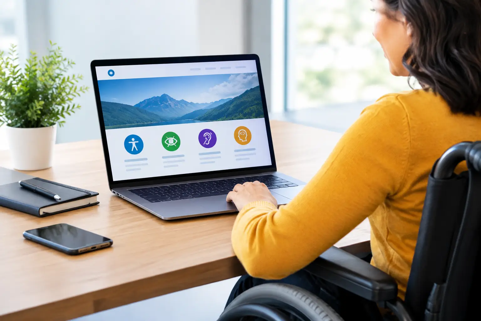
A resident trying to pay a utility bill should not have to guess which field is required. A prospective customer using a keyboard should not get stuck in a menu. A visitor with low vision should be able to read your service information without enlarging the screen until the layout breaks.
That is the practical value behind a website accessibility guide. Accessibility is not a decorative add-on or a one-time compliance task. It is a disciplined way to make digital information, services, and communications work for more people under more circumstances. For businesses and government organizations, it can improve customer service, reduce friction, support trust, and create a website that is easier for everyone to use.
Why accessibility belongs in your web strategy
People interact with websites in different ways. Some use screen readers, voice control, keyboards, magnification tools, captions, or alternate input devices. Others may be dealing with a temporary injury, a slow connection, bright outdoor light, an aging device, or a crowded office where audio is not practical. A site designed with accessibility in mind handles these situations more clearly.
There is also a business case. When visitors can find information, complete forms, and understand next steps, they are less likely to abandon the process or call your team for help. Clear heading structures, descriptive buttons, readable contrast, and predictable navigation are good usability practices, not niche technical details.
For public-facing organizations, accessibility may also carry legal and policy obligations. Requirements vary by organization, funding source, location, and the type of service being provided. Standards and legal expectations can change, so accessibility work should be reviewed with the appropriate legal, compliance, and procurement teams rather than treated as a generic legal checklist.
Website accessibility guide: start with the visitor journey
The most effective first step is not opening a code editor. It is identifying what visitors need to accomplish. List the high-value journeys on your site: requesting a quote, applying for a program, paying an invoice, registering for an event, submitting a support request, downloading a form, or finding a location.
Then walk through each journey as a visitor would. Can someone understand the purpose of the page from the main heading? Is the call to action specific? Does the process provide useful feedback when something goes wrong? A button labeled “Submit” may technically work, but “Send service request” gives the visitor more confidence about the outcome.
This approach helps teams prioritize. A minor issue on an archived news page deserves attention, but a keyboard barrier in an online payment form should move to the front of the queue. Accessibility improvements are most useful when they protect the paths that matter most to the people you serve.
Use recognized standards as a working benchmark
Web Content Accessibility Guidelines, commonly called WCAG, provide a widely used framework for accessible web content. Many organizations use WCAG 2.1 or 2.2 Level AA as a practical target, although the right benchmark depends on your obligations and project scope.
The framework is built around four useful questions. Can visitors perceive the content? Can they operate the interface? Can they understand what is happening? Can assistive technology reliably interpret the site? These questions turn a large subject into decisions a design, content, and development team can apply daily.
Build accessible foundations before visual polish
A polished homepage cannot compensate for confusing structure. Start with the underlying building blocks: meaningful page titles, one clear primary heading, logical heading levels, and page regions that help users understand where navigation, main content, and supporting information begin and end.
Headings should describe the content that follows. Avoid using them only because a phrase looks visually appealing at a certain size. If the text is not truly a section heading, style it with CSS rather than placing it in a heading tag. This distinction matters to screen reader users who often navigate a page by headings.
Links and buttons need equally clear language. “Learn more” is acceptable only when its destination is obvious from nearby context. In a row of service cards, more specific labels such as “Learn about managed IT support” remove ambiguity. Buttons should trigger an action, while links should take people to a new destination. Keeping that pattern consistent makes a site easier to predict.
Keyboard access is another essential foundation. Every interactive element should be reachable with the Tab key, operable without a mouse, and visibly focused when selected. Dropdown menus, pop-ups, calendars, chat tools, and embedded third-party forms are common trouble spots. If a visitor cannot see where focus has moved, a functional page can become effectively unusable.
Design for readability, not just brand consistency
Brand standards and accessibility should reinforce each other. A recognizable color palette matters, but text and essential icons need enough contrast against their backgrounds. Light gray text may look refined in a design mockup while becoming difficult to read on a phone outdoors or for someone with low vision.
Do not rely on color alone to communicate status. A form error shown only in red can be missed by visitors who do not distinguish that color. Pair color with plain language, an icon when appropriate, and guidance about how to fix the issue. For example, “Enter a valid email address” is more helpful than “Invalid input.”
Typography deserves the same care. Use readable type sizes, sufficient line spacing, and layouts that still work when visitors enlarge text. Resist designs that lock content into fixed-height boxes or make users scroll sideways on a mobile device. Good responsive design and accessible design often solve the same problem.
Make forms and documents easier to complete
Forms are where accessibility, customer service, and conversion meet. Each field needs a visible label, not placeholder text that disappears as soon as someone begins typing. Required fields should be identified consistently, instructions should appear before a task is attempted, and errors should be tied to the relevant fields.
If a form spans several steps, tell visitors where they are in the process and what they will need before they begin. Give people a chance to review important information before submitting it. For complex government, HR, financial, or application workflows, this clarity can prevent costly errors and follow-up work.
Documents require their own review. A PDF that looks fine on screen may be inaccessible if it lacks tagged structure, meaningful headings, readable tables, and alternative text for informative images. Whenever possible, provide important information as accessible web content rather than placing essential instructions only inside a downloadable document.
Treat media and images as information, not decoration
Alternative text tells people who cannot see an image what they need to know about it. The right description depends on the image’s purpose. A decorative background flourish usually needs no description. A chart showing program participation trends needs a text alternative that communicates the meaningful takeaway, not a catalog of colors and shapes.
Videos should include accurate captions. If the video conveys important visual information that is not explained aloud, consider audio description or a written alternative. Audio-only content should have a transcript. These measures also help visitors watching without sound, searching for a specific point, or reviewing content quickly.
Test with tools, then test with people
Automated accessibility scanners are useful for finding repeatable technical issues such as missing form labels, empty links, and some contrast failures. They are not enough on their own. A scanner cannot reliably determine whether your alternative text is useful, whether a form’s instructions make sense, or whether keyboard focus follows a logical path.
Pair automated checks with manual testing. Navigate important pages with only a keyboard. Zoom text significantly. Review the site on a phone. Use a screen reader for key tasks if your team has the capability, and include people with disabilities in testing when possible. Their experience can reveal barriers that a checklist will not catch.
Third-party tools deserve special scrutiny. Scheduling platforms, payment gateways, maps, chat widgets, document viewers, and applicant portals can introduce barriers into an otherwise well-built site. Ask vendors about their accessibility documentation, test their actual interface, and include accessibility expectations in contracts when feasible.
Make accessibility an ongoing operating habit
A redesigned website can lose accessibility quickly if new content is added without clear standards. The solution is not to make every employee an expert developer. It is to create simple, repeatable practices for the people who publish content, approve designs, buy software, and maintain the site.
Create a short editorial checklist for images, headings, links, documents, and video. Build accessible components into the website so staff are not forced to reinvent patterns for every page. Schedule periodic reviews of high-traffic and high-risk journeys, especially after platform updates or vendor changes.
OneStop Northwest approaches web work as part of a wider brand and technology system. That perspective matters because accessible content, design, development, and operational processes have to support one another. A beautiful brand is stronger when every visitor can understand it and act on it.
The next useful move is simple: choose one important visitor task this week and complete it without a mouse, without relying on color, and without assuming every visitor sees or hears the page the same way. The friction you find is a practical starting point for a better digital service.