

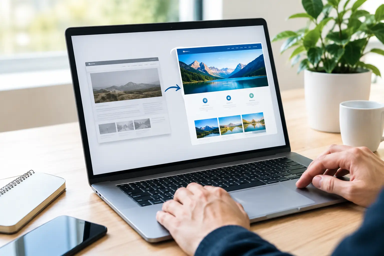
A website redesign is rarely just a visual refresh. The strongest website redesign case study examples show what happens when an organization fixes a real business problem: confusing service pages, outdated technology, inconsistent branding, weak lead flow, or a site that no longer reflects the quality of its work.
For growing businesses and public-facing organizations, the website often has to do several jobs at once. It must build trust, explain complex offerings, support internal teams, meet accessibility expectations, and make it easy for visitors to take the next step. The examples below are representative scenarios based on common redesign challenges. They illustrate the strategic decisions behind results, not a one-size-fits-all formula.
What a useful redesign case study should reveal
A before-and-after screenshot can be compelling, but it does not tell the whole story. A useful case study explains the starting problem, the audience, the decisions made during the redesign, and the business measures used to judge success.
That last point matters. More traffic is not always the right goal. A regional contractor may need more qualified estimate requests, while a government department may need fewer calls about forms that should be easy to find online. A professional services firm may care most about credibility with decision-makers before the first conversation.
The design is visible. The strategy behind it is what makes the redesign valuable.
Website redesign case study examples for common challenges
1. The manufacturer with strong capabilities and an unclear story
A mid-sized manufacturer had earned repeat business through reliable production, but its website made the company look smaller and less specialized than it was. The homepage opened with broad marketing language, product categories were difficult to compare, and the site gave no clear path for engineers or procurement teams looking for specific capabilities.
The redesign began with discovery sessions involving sales, operations, and customer service. Each team described a different customer question they answered repeatedly: material options, tolerances, lead times, certifications, and production capacity. Those questions became the backbone of the new site structure.
Rather than leading with generic claims, the redesigned homepage introduced the company through its primary industries, technical strengths, and proof points. Service pages were organized around buyer needs, and downloadable specification materials were paired with clear quote-request options. Photography showed actual equipment, people, and finished work instead of relying on stock images.
The key trade-off was simplicity versus technical detail. Too little detail would frustrate qualified buyers. Too much detail on every page would overwhelm visitors early in their research. The solution was layered content: a concise overview first, followed by specifications and deeper resources for visitors who needed them.
Success was measured through qualified inquiry quality, the number of quote requests tied to priority services, and sales feedback about whether leads arrived better informed. This is a good reminder that a redesign can support sales without turning every page into a hard sell.
2. The local service business losing leads on mobile
A home services company relied on referrals and paid search, yet its website created friction after the click. Pages loaded slowly on mobile devices, phone numbers were inconsistent, and the contact form asked for more information than most homeowners were prepared to provide during an urgent repair situation.
The redesign focused on speed, clarity, and reassurance. The new navigation used plain-language service categories. Prominent service-area information helped visitors quickly confirm whether the company could help. Each core service page answered practical questions about timing, process, and what customers could expect before an appointment.
The contact experience was also simplified. Visitors could call, request service, or submit a short form without hunting through the site. Trust signals such as licensing information, customer feedback, and team photos were positioned near decision points rather than hidden on a separate page.
In this type of project, visual sophistication is less important than removing hesitation. A highly animated website may look impressive in a presentation but can slow down a visitor trying to schedule a repair from a parking lot or kitchen table. Faster pages and direct calls to action often produce a better outcome.
The team tracked mobile conversion rate, call volume from organic visitors, form completion rate, and the proportion of leads within the intended service area. Those measures reveal whether the site is generating useful demand rather than simply attracting clicks.
3. The professional firm that needed to earn trust earlier
A consulting firm had experienced advisors and a strong record of client retention. Its old site, however, read like an online brochure from another era. Long paragraphs buried the firm’s point of view, biographies followed inconsistent formats, and prospective clients could not quickly understand who the firm served or why its approach was different.
The redesign centered on positioning. Before choosing colors or page layouts, the team clarified the firm’s ideal client profiles, high-value services, and language that reflected how clients described the relationship. That work shaped the message hierarchy across the site.
The new homepage led with a specific statement about the problems the firm helps solve. Service pages used a repeatable format: the challenge, the approach, the likely outcomes, and the right next conversation. Advisor bios included personal credibility as well as relevant expertise, making the firm feel capable without sounding distant.
Thoughtful content played an important role. Instead of publishing articles for volume, the firm created a smaller library of practical resources that addressed recurring client concerns. This gave prospects a reason to stay on the site and helped the sales team share useful follow-up material.
For firms selling expertise, visitors often need several interactions before reaching out. Metrics such as engaged time, visits to team and service pages, resource downloads, and consultation requests are more meaningful than a single page-view number. The redesign should support that longer trust-building process.
4. The public organization with an information overload problem
A public-facing organization had accumulated years of pages, PDFs, announcements, and departmental content. Residents struggled to find payment options, meeting information, permits, and emergency updates. Staff also spent significant time answering questions that the website should have addressed clearly.
This redesign required a different mindset from a commercial lead-generation site. The goal was not to persuade a visitor to buy. It was to help residents complete tasks accurately and quickly while making essential information accessible to everyone.
The project started with a content inventory and task analysis. The team reviewed which pages received traffic, what people searched for, and which requests generated the most calls. Outdated information was archived, duplicate pages were combined, and the new navigation was based on resident tasks rather than internal department names.
Search functionality, accessible page templates, readable document practices, and a clear emergency-alert area became core requirements. Department staff received governance guidance so the site could remain organized after launch. Without that operational plan, even a well-designed public website can become cluttered again within months.
Results in this scenario should include successful task completion, search terms with no results, reduced routine inquiries, accessibility compliance progress, and staff confidence in updating content. A redesign is more durable when people inside the organization can maintain it responsibly.
5. The growing company with disconnected brand and web experiences
A business had expanded its services, hired new staff, and invested in marketing materials, but its website still reflected an earlier stage of growth. Its logo usage, colors, messaging, and service descriptions varied across the website, proposals, social profiles, and printed materials. Prospects received a different impression depending on where they encountered the brand.
The redesign became part of a broader brand alignment effort. The team defined a clearer visual system, refined messaging, and established standards for how services would be described across channels. The website then served as the central source of truth for the brand rather than one disconnected piece of it.
This is where a holistic partner can be especially helpful. OneStop Northwest LLC approaches web development alongside brand, marketing, and technology needs, which can reduce the gaps that appear when each element is handled in isolation.
The new website used consistent language and visual cues from the first homepage visit through contact forms, proposals, and follow-up communications. Service pages connected related offerings without creating confusion about what the company actually does. The result was not simply a more attractive site. It was a more coherent customer experience.
The best measures here may include brand consistency across materials, sales team adoption of new messaging, service-page engagement, and feedback from customers who say they understand the company more quickly. Brand clarity has a practical effect: it shortens the time spent explaining the basics.
6. The organization that treated launch as the finish line
One common redesign story is not a success at first. A company launches a polished website, then fails to assign ownership for content updates, security, search optimization, and performance checks. Six months later, staff photos are outdated, event information has expired, and new services are missing from the navigation.
A better approach builds maintenance into the project from the beginning. Before launch, identify who approves content, who can publish updates, what should be reviewed quarterly, and how technical updates will be handled. Train the people who will use the system every week, not just the people who attended the kickoff meeting.
This does not mean every organization needs a large internal web team. A small business may only need a simple monthly process and a dependable outside partner. A larger organization may need formal permissions, content workflows, and reporting. The right model depends on the volume of change and the consequences of inaccurate information.
How to use these examples before your own redesign
The most valuable lesson from these website redesign case study examples is to start with the problem, not the homepage mockup. Ask what customers, residents, partners, or employees struggle to do today. Then identify the evidence: analytics, search behavior, sales questions, support tickets, stakeholder interviews, and user feedback.
From there, set a limited number of meaningful goals. A redesign can improve many things, but trying to solve every business challenge at once usually leads to unclear priorities. Decide what the site must do better, who it must serve first, and how you will know the work is paying off.
A website should make your organization easier to understand and easier to work with. When the strategy, content, design, and technology support the same purpose, the redesign becomes a practical business asset that keeps earning its place long after launch.