

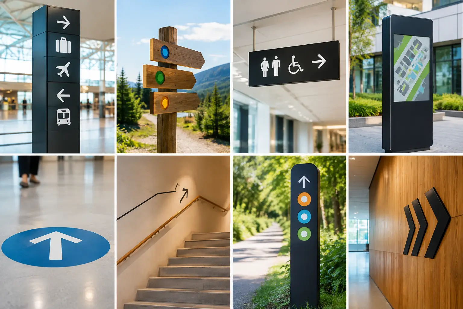
A visitor should not have to stop, scan a lobby, and wonder where to go next. Yet that small moment of uncertainty happens every day in offices, medical facilities, campuses, retail spaces, and public buildings. The best wayfinding design examples solve it before it becomes a frustration. They make a space easier to use while giving every sign, color, and message a clear connection to the organization behind it.
Wayfinding is often treated as a signage purchase. It is better understood as a communication system. It helps people arrive, orient themselves, make decisions, and leave with confidence. For businesses and government organizations, that improves the visitor experience, supports accessibility, reduces interruptions for staff, and turns a physical location into a more consistent expression of the brand.
What Makes Wayfinding Design Work?
Effective wayfinding answers a visitor’s questions in the order they occur: Where am I? Where do I need to go? Which path gets me there? How do I know I have arrived? A sign with attractive typography cannot do its job if it is placed after the decision point. Likewise, a complete directory is not useful if people cannot understand it in a few seconds.
The strongest systems combine hierarchy, placement, language, and visual consistency. Primary destinations need the largest and clearest treatment. Secondary information should support the journey without competing for attention. Colors, icons, floor names, and arrows must mean the same thing everywhere they appear.
There is also a practical trade-off. A highly branded system can create a memorable impression, but too much decoration may slow down comprehension. In a hospital, courthouse, or transportation hub, clarity should lead. In a boutique hotel or customer-facing office, the brand can play a more visible role, as long as directions remain immediate.
8 Wayfinding Design Examples Worth Studying
1. A lobby directory that sorts destinations by visitor need
A multi-tenant office building may have dozens of suites, but visitors rarely need every name at once. A better directory groups information by purpose: reception, leasing, public services, conference rooms, elevators, and tenant floors. Large destination names and floor numbers allow a person to make a quick choice before moving on.
Digital directories can add search and real-time updates, but they are not automatically better. A printed or dimensional directory is often more dependable, easier to maintain, and more useful during a power or network outage. The right choice depends on how often occupants change and how complex the building is.
2. Color-coded floors in a medical facility
Healthcare environments are full of stressful decisions, and visitors may be unfamiliar with clinical terms. One effective approach assigns each floor or department a distinct color and pairs it with plain-language naming. A patient headed to imaging, for example, can follow a consistent color band from the parking area to registration and then to the department entrance.
Color should never carry the entire message. It needs support from readable text, symbols, and strong contrast for people with color-vision differences. The result is a system that reduces reliance on staff members for routine directions while helping visitors feel more in control.
3. A campus map built around routes, not building lists
Large schools, corporate campuses, and government complexes often begin with a map packed with labels. That can look informative while leaving a first-time visitor overwhelmed. A useful campus map prioritizes the routes people actually take: parking to admissions, visitor entrance to council chambers, or main lobby to training center.
A “you are here” marker, an orientation that matches the viewer’s direction, and clearly marked paths make the map actionable. Pairing the map with trailblazing signs at key turns creates continuity. The map explains the larger setting; the smaller signs reassure people that they remain on the right path.
4. Branded environmental graphics in an office
Wayfinding does not have to look institutional. An organization with multiple departments can use wall graphics, room identifiers, and controlled color zones to establish a recognizable environment. A financial firm might use refined typography and subtle material contrasts. A creative agency may use bolder murals and playful naming, provided the essential directions are still easy to read.
This is where brand strategy and wayfinding strategy should meet. The logo alone is not the brand experience. When the typography, voice, color palette, and signage materials all work together, visitors receive a more credible impression of the organization. Employees benefit, too, especially in workplaces that welcome clients, vendors, and job candidates.
5. Parking guidance that starts before the front door
Many wayfinding problems begin in the parking lot. If guests do not know which entrance serves them, they may arrive late, enter through a restricted door, or call reception from their car. Directional signs at the property entrance should name the most relevant destinations and guide drivers to visitor parking, accessible spaces, pickup areas, and building entries.
This example demands restraint. Drivers have limited time to read, so signs require larger type, minimal wording, and uncomplicated arrows. A detailed message that works perfectly at walking speed can fail completely from a moving vehicle.
6. Retail zones that help customers browse without pressure
Retail wayfinding can improve both service and sales when it helps shoppers understand the store layout. Department markers, fitting-room signs, checkout cues, and pickup instructions should reflect the retailer’s visual identity while remaining direct. A home goods store may organize departments by room. A specialty shop may use category icons that match package labels.
The goal is not to force a route through every aisle. It is to make exploration feel comfortable. Customers who can find an item, return to a section, or locate help quickly are more likely to stay engaged with the space.
7. Accessible signage that serves more people well
Accessibility is a core design requirement, not an add-on at the end of a project. Room signs with tactile characters and Braille, sufficient contrast, appropriate mounting heights, and clear pictograms help people navigate independently. Audio cues, digital displays, and staff-facing support can also be valuable in complex settings.
Requirements vary by location and facility type, so compliance should be addressed early in planning. Beyond meeting standards, accessible wayfinding signals respect. It recognizes that visitors process information, move through spaces, and use environments in different ways.
8. Temporary event signs that fit the permanent system
Conferences, public meetings, training sessions, and seasonal programs often create a short-term navigation challenge. Temporary signs are commonly made at the last minute, which is why they can look disconnected from the building and send people in conflicting directions.
A better approach uses an approved template with the same typography, colors, arrows, and naming conventions as the permanent system. Changeable inserts, tabletop signs, window graphics, and directional decals can be prepared quickly without compromising consistency. For organizations that host frequent events, this is a practical way to protect both visitor flow and brand standards.
How to Turn Inspiration Into a Usable System
The most useful wayfinding design examples are not copied exactly. They are adapted to the location, audience, and real decisions people make. Start by walking the site as a first-time visitor. Enter from the parking area, find reception, locate a restroom, and attempt to reach a common destination without asking for help. Each hesitation reveals a possible gap.
Next, identify the highest-priority user groups. A municipal building may need to serve residents, vendors, staff, and emergency responders. A growing business may need to guide clients while making onboarding easier for new employees. Their routes may overlap, but their needs are not identical.
Then create a sign hierarchy before selecting materials. Consider what belongs at the property entrance, decision points, corridors, doors, and destination areas. This prevents the common mistake of producing many attractive signs that do not function as a coordinated system.
At OneStop Northwest, we see the strongest results when wayfinding is planned alongside brand identity, environmental graphics, print production, and digital communication. That coordination helps organizations avoid mismatched colors, outdated naming, and costly rework as their spaces evolve.
A clear route is a quiet form of customer service. When people can find their way without effort, they have more attention for the meeting, purchase, appointment, or public service that brought them there.